/
Marketing Tips
The Small Business Guide to Building a Brand Identity on a Budget
Build a professional brand identity without spending thousands. A practical guide covering logo, colors, typography, photography style, and voice — with specific tools and templates.
Your brand is not your logo. It is not your color palette. It is not even your tagline. Your brand is the gut feeling someone has when they see your business name, visit your website, or scroll past your social media post.
But here is the paradox: you build that gut feeling through consistent visual and verbal identity — and that takes intentional design work. For small businesses without a $20,000 branding budget, this can feel out of reach. It is not. Here is how to build a professional brand identity without breaking the bank.
What Brand Identity Actually Includes
Before we talk about saving money, let us define what we are building:
- Visual identity: Logo, colors, typography, photography style, graphic elements
- Verbal identity: Voice, tone, key messages, tagline
- Brand experience: How customers interact with you across every touchpoint
Most small businesses focus exclusively on the logo and ignore everything else. That is like choosing a great outfit but never washing your hair — one element cannot carry the entire impression.
The Budget Brand Stack
Here is how to build each component affordably:
Logo: $0-500
Do not overspend on a logo. A clean, simple wordmark or lettermark is perfectly professional and costs far less than a complex illustrated logo. Options:
- DIY wordmark ($0): Your business name in a well-chosen Google Font. Montserrat, Inter, or Playfair Display work beautifully for different brand personalities.
- Freelance designer ($200-500): Hire someone on Upwork or Fiverr for a simple, professional logo. Look for designers with strong portfolio reviews. Ask for a wordmark plus one icon mark.
- Logo generator ($20-50): Tools like Looka or Hatchful produce decent results for businesses that need something fast.
The rule: Your logo should look good at 32px (favicon) and at 320px (website header). If it requires explanation, it is too complex.
Color Palette: $0
Choosing brand colors costs nothing but requires intention. Follow the 60-30-10 rule:
- 60% — Primary background color. Usually white, off-white, or very dark for dark brands.
- 30% — Secondary color. Your main brand color. This is what people associate with your business.
- 10% — Accent color. Used for calls to action, highlights, and emphasis.
How to choose your secondary color: Think about the emotion you want to evoke.
| Emotion | Colors | Industries |
|---|---|---|
| Trust and reliability | Blue, navy | Finance, healthcare, tech |
| Energy and urgency | Red, orange | Food, fitness, retail |
| Growth and health | Green, teal | Wellness, organic, outdoor |
| Luxury and sophistication | Black, gold, deep purple | High-end services, fashion |
| Warmth and friendliness | Yellow, warm orange | Hospitality, family services |
| Creativity and innovation | Purple, magenta | Creative services, tech startups |
Document your exact hex codes. Write them down. Put them in a Google Doc. Reference them every single time you create anything visual.
Typography: $0
Google Fonts gives you access to the same typefaces used by professional brands. Pick two:
- Heading font: Something with personality. Montserrat (modern), Playfair Display (elegant), Oswald (bold), Raleway (clean).
- Body font: Something highly readable. Inter, Lora, Open Sans, Source Sans Pro.
Use these consistently across your website, social media graphics, and any printed materials.
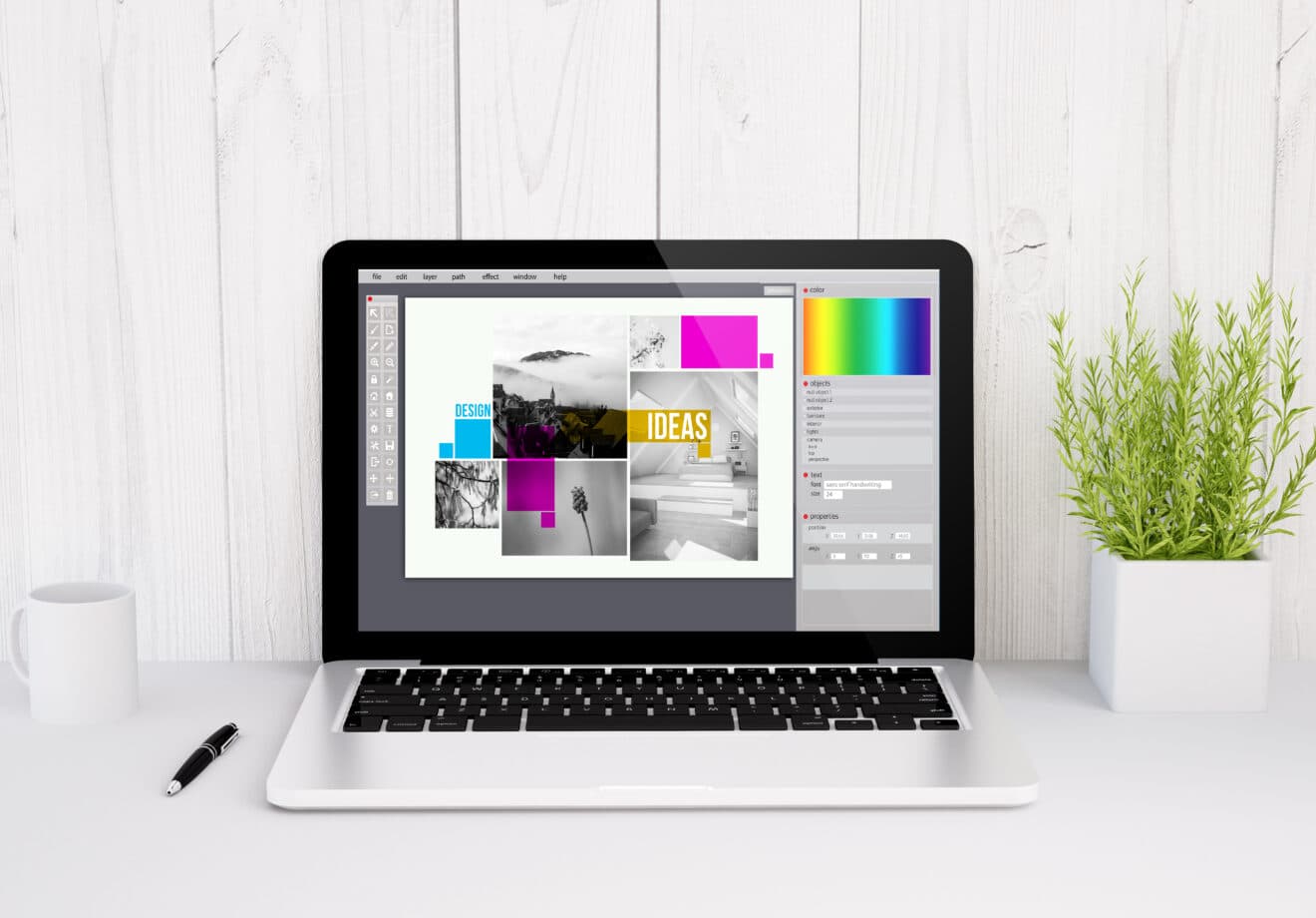
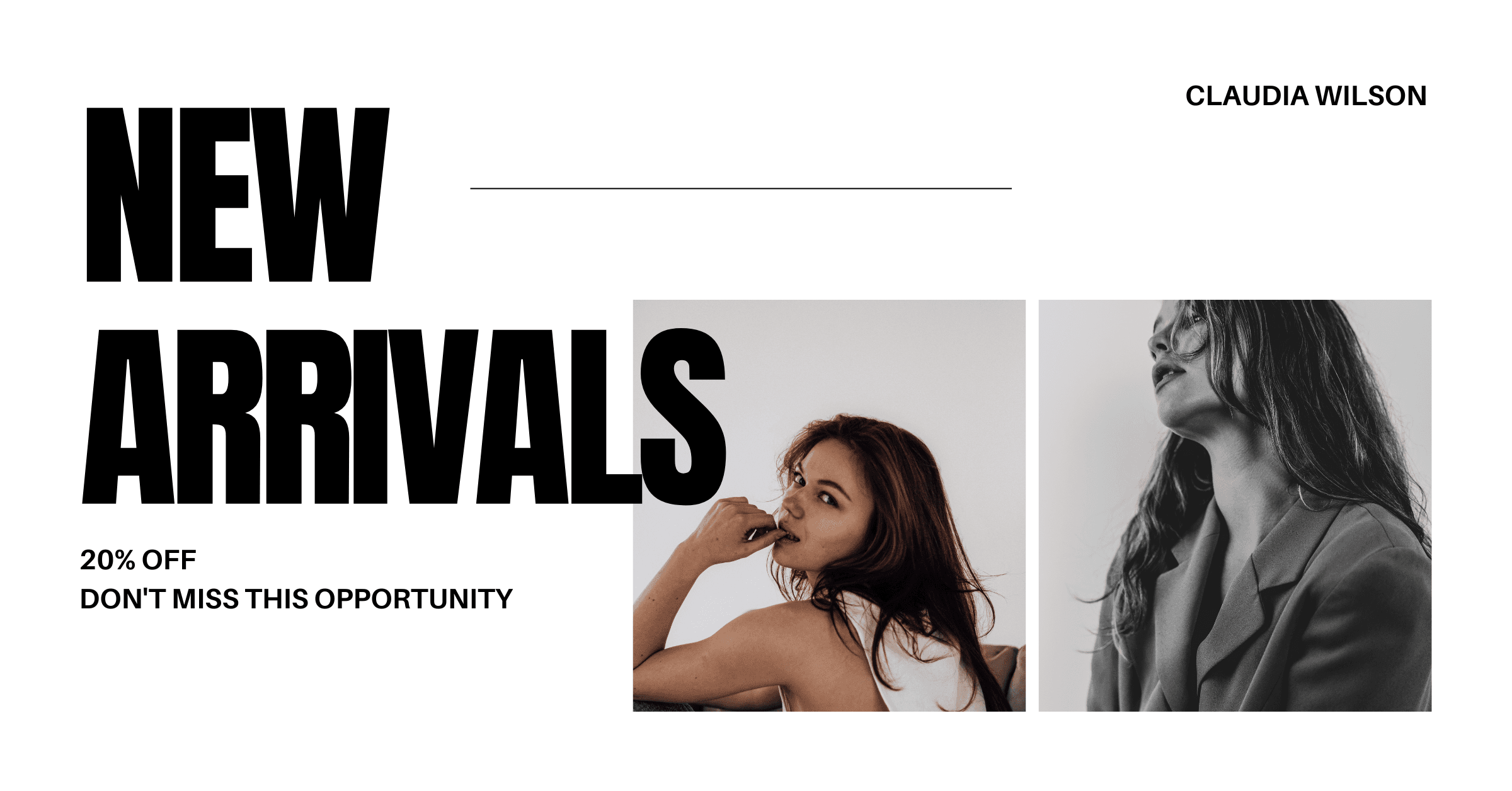
Photography Style: $12-29/month
This is where most budget brands fall apart. They nail the logo and colors, then use random, inconsistent stock photos that undermine everything.
AI image generation solves this problem. With The Image Generator, you can produce an unlimited library of on-brand imagery that shares the same style, mood, and color temperature. Every image feels like it belongs to the same brand because it was generated with the same style presets and brand guidelines.
Example workflow:
- Choose a photographic style that matches your brand (e.g., "warm natural lighting, earth tones, minimalist composition")
- Generate all your marketing visuals using that same style description
- Build a library of 50-100 images that are instantly recognizable as yours
This consistency is what separates amateur brands from professional ones — and it costs under $30/month instead of thousands in custom photography.
Brand Voice: $0
Your brand voice is how you write. Define it with four attributes:
Example: "Friendly but knowledgeable. Conversational but not sloppy. Confident but not arrogant. Helpful above all."
Write this down and reference it whenever you create content. Read your social media captions, email newsletters, and website copy aloud — does it sound like the same person speaking? If not, adjust.
Putting It All Together
Here is a one-page brand identity template:
BRAND IDENTITY — [Your Business Name]

Logo: [filename/location]
Primary color: #______ (used for headers, buttons, key elements)
Secondary color: #______ (used for backgrounds, secondary elements)
Accent color: #______ (used for CTAs and highlights)
Heading font: [font name]
Body font: [font name]
Photo style: [2-3 sentence description]
Voice: [4 adjectives describing your tone]
Tagline: [if you have one]
This single document ensures that everything you create — from an Instagram post to a business card to a Facebook ad — looks and feels like it belongs to the same brand.
The Consistency Multiplier
Here is a truth that justifies every minute spent on brand identity: consistent brands are worth up to 3.5x more than inconsistent ones. Consistent presentation across platforms increases revenue by an average of 23%.
Why? Because consistency builds recognition. Recognition builds trust. Trust drives purchasing decisions.
A customer who sees your consistently branded Instagram post, then visits your consistently branded website, then receives your consistently branded email newsletter is exponentially more likely to buy than someone who encounters a different visual identity at each touchpoint.
When to Invest in Professional Branding
The DIY approach works well for businesses in their first 1-3 years or those spending under $5,000/month on marketing. But there comes a point where professional branding delivers outsized returns:
- You are scaling beyond your local market and need to compete with established brands
- You are launching a major campaign and want everything dialed in
- Your visual identity has become inconsistent across channels and needs a reset
- You are repositioning to target a different market segment
When that time comes, partnering with a branding and web design agency ensures your brand identity is strategically designed to support your business goals — not just aesthetically pleasing, but engineered to attract your ideal customers and differentiate you from competitors.
Your Brand Identity Action Plan
This week:
- Choose your color palette (primary, secondary, accent) and document the hex codes
- Select your heading and body fonts from Google Fonts
- Write your four brand voice adjectives
Next week: 4. Create or finalize your logo 5. Generate your first batch of on-brand images with The Image Generator 6. Fill out the one-page brand identity template above
Ongoing: 7. Reference your brand guide before creating any new content 8. Audit your channels quarterly — does everything still feel consistent? 9. Update your brand photography library monthly with fresh AI-generated visuals
A strong brand identity does not require a big budget. It requires intention, consistency, and the discipline to follow through on the decisions you make. Start today and let consistency do the compounding work.
Try The Image Generator Free
Create professional marketing visuals with AI. No design skills required. 3 free generations to start.
Start Creating — It's Freebrand identitybranding on a budgetsmall business brandingvisual identitybrand colorsbrand consistencyDIY brandingmarketing strategy
Related Posts
Marketing TipsFeb 15, 2026
How to Build a Visual Marketing Strategy That Drives Revenue
A step-by-step framework for building a visual marketing strategy that drives engagement, builds brand recognition, and converts followers into customers.
Marketing TipsFeb 15, 2026
Facebook Ad Image Sizes & Best Practices for 2026
Complete guide to Facebook ad image sizes in 2026. News Feed, Stories, Carousel, Marketplace — every dimension you need plus design best practices.
